
Data Visualization Applications: Pie Charts
October 2024
This article is rated as:


Pie charts are useful for visualizing proportions of a whole, making it easy to compare the relative sizes of categories. However, pie charts have a somewhat bad reputation because of their potential to misrepresent data, especially when there are too many categories or when differences between slices are subtle. This leads to visual clutter that is difficult to interpret. That said, pie charts can still be effective when applied properly. They work best with few, distinct categories, where differences between slices are visually apparent. When used sparingly and appropriately, pie charts can be an effective means of visualizing categorical data.
When used appropriately, pie charts offer several benefits:
Simplicity: They present data in a straightforward, familiar format that can be quickly understood.
Visual Appeal: Pie charts are often visually engaging, making data presentation more appealing.
Quick Insights: They provide immediate insights into data composition, highlighting categories with the largest proportions.
Here we’ll show you how to use pie charts effectively to improve your data storytelling and avoid common but inappropriate uses. For this article, I have compiled some real-world data inspired by the current state of my office. I have created a list of my daughter’s favourite activities, including - “Redecorating” dad’s office - as he attempts to write this article.
For reference, we have several additional resources, including a “Data Viz Decision Tree Infographic”, on Eval Academy to assist in selecting the appropriate data visualization and preparing data for effective data visualization:
Data Preparation
This article assumes that data are already prepared in a clean and organized format (see below). It is important that the sum of all categories equal 100%. Pie charts are ineffective at visualizing data exceeding 100%, as they are designed to present data as a proportion of a whole.

To get the most out of your pie chart, sort your data from largest to smallest proportion. This will improve the look of the pie chart (even before we clean and improve the default Excel output).
Highlight the data table.
Navigate to Data > Sort.
Sort by > Percentage from largest to smallest.

Initial Chart Selection
Highlight the data to be included in the pie chart.
Navigate to Insert along the top ribbon of Excel.
Within Insert go to Charts > 2-D Pie > Pie (a basic Excel-formatted chart should appear).
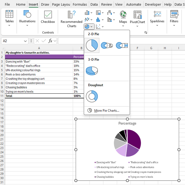
IMPORTANT: Never use the 3-D Pie chart option. 3-D charts are rarely a good idea, and 3-D Pie charts, particularly, hinder interpretation as relative proportions are more difficult to distinguish.
Applying Data Visualization Best Practices
We now have a pie chart. However, this initial pie chart can be significantly improved using data visualization best practices.
Improve the Appearance
Aggregate Categories
You’ll immediately notice that this example has too many slices. Pie charts are much better at visualizing data with fewer slices. This can be accomplished by aggregating categories into broader, overarching categories (i.e., aggregating like categories together) or combining smaller percentages into an “Other” category to improve visualization (e.g., the smallest proportions to bring categories to five or fewer). For this example, we’ll use the latter approach to aggregate some of the smaller categories into an “Other" category.
Create a new table keeping the top four categories as is.
Type in Other as the fifth category.
Use the SUM function to sum up the bottom four categories.

Note: You do not need to have five categories. However, more than five categories usually detract from the message being delivered in a pie chart. It is better to have fewer slices and to highlight a few categories.
4. Repeat the steps from Initial Chart Selection

Highlight Key Data Points (& Mute Other Data Points)
With categories reduced, I will provide an additional two alternatives for presenting the data: (1) highlight my daughter’s favourite activity and (2) highlight dad’s “favourite” activity. The largest proportion is often most important, but not always. Sometimes smaller proportions, or specific categories, are of most interest.
Alternative #1: Daughter’s Favourite Activity
Click on the pie chart and navigate to Chart Design > Change Colors.
Select a monochromatic greyscale palette.

Note: This is a quick approach to quickly mute all slices. However, you may want more contrast in the muted cells. For this, you may select each slice individually and select a specific shade of grey or another muted (i.e., low saturation) colour of choice.
3. Now right-click on the largest slice and change the colour to your primary colour of choice.

Alternative #2: Dad’s “Favourite” Activity
The same as Alternative #1, click on the pie chart and navigate to Chart Design > Change Colors.
Select a monochromatic greyscale palette.
Right-click on the largest slice and change the colour to your primary colour of choice.

Improve the Legend
For many charts, I would typically recommend deleting the Legend and labelling directly onto the chart or creating a custom legend. This includes pie charts when labels are short and categories few (e.g., a survey with Yes, No, and Unsure response categories). However, pie charts are one of the few charts that benefit from a legend when data labels are long or slices many to avoid overcrowding the slices with labels.

You may wish to move the legend depending on the space available. To accomplish this, right-click on the legend below the pie chart.
Go to Format Legend… and select the Legend Position that works best for your chart.

Insert Data Labels
One of the pitfalls of a pie chart is that it is difficult to distinguish the relative difference in size between slices. Therefore, it is beneficial to label all slices with their relative sizes (i.e., count or proportion).
Navigate to Chart Elements and toggle on Data Labels.


Resize the Chart
Left-click on the chart and navigate to the Format tab at the top of the spreadsheet.
Resize the Shape Height and Width to improve the look of the chart.
Adjust Fonts
1. Left-click on the chart to highlight the pie chart.
2. In the Home tab, select your Font of choice.
Sans serif fonts are best for charts. Ideally, chart fonts will match the rest of a report/ presentation to ensure consistency.
3. Adjust the Font Size to at least 9 pt.
9 pt is our recommended minimum font size for charts.
Improve the Chart Title
The column heading (in this example, “Percentage”) will automatically default as the chart title. Update the chart title with something that is both descriptive and informative.
1. Left-click on the Chart Title.
2. Type in your improved title and hit Enter.
The chart title may be edited within the function bar at the top of your spreadsheet.
You may also opt to right-click on the chart title and Edit Text to improve the chart title.
You can enter a subtitle by using Alt + Enter to move down a line.
3. Emphasize the chart title by increasing the main title to 14 pt font.
A subtitle, if you have one, can be deemphasized using a slightly smaller 12 pt font.
When drafting the title within the line chart, you will have to highlight the specific section of text for which you wish to apply changes. Otherwise, all changes to the font will apply to the whole title.
4. Use your primary colour to further emphasize the main point within the chart title.
Alternative #1

Alternative #2

Final Thoughts
Pie charts are a useful tool for visualizing proportions when used appropriately. They excel when dealing with data that has a limited number of categories, less than five is best. They offer simplicity, visual appeal, and the ability to provide quick insights into data composition. However, they should be used sparingly and with intention to gain the most impact, and never ever in 3D!