
Data Visualization Applications: Line Charts
July 2024
This article is rated as:


Here we will continue our Data Visualization Applications series with an introduction to line charts. Line charts are a versatile and effective tool for charting time series or continuous data. Here we will outline how to create impactful line charts within Excel 365 to best communicate compelling data stories.
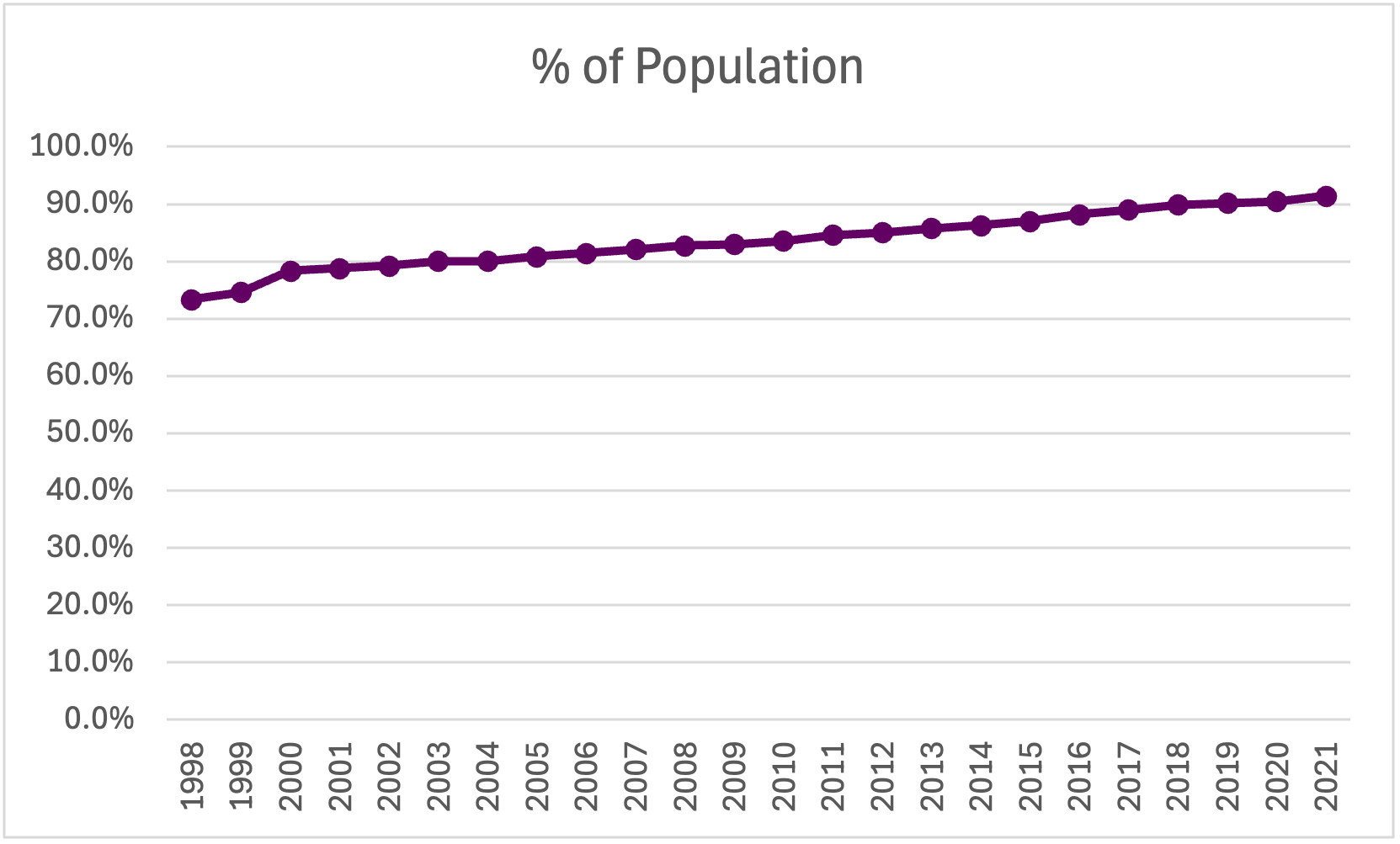
For this tutorial, we will look at the percentage of the World’s population with access to electricity between 1998 and 2021. This data set will provide a clear example of the basics of making effective line charts. The skills learned are applicable to other time series data.
Again, this tutorial assumes data are prepared for charting. However, if your data require cleaning and additional preparation, feel free to review some of our other resources:
Initial Chart Selection
1. Highlight the data to be included in the line chart.
2. Navigate to Insert along the top ribbon of Excel.
3. Within Insert go to Charts > 2-D Line > Line (a basic Excel-formatted chart should appear)

Applying Data Visualization Best Practices
Though you technically now have a line chart, the following sections will outline the process for transforming the default Excel line chart into a compelling, professional-looking line chart by applying data visualization best practices.
First Impressions
It is important to review the initial Excel chart before applying data visualization best practices. When reviewing the initial line chart we should ask:
a) Does the output reflect the raw data? (i.e., Is the correct data range selected? Are there any anomalies in the chart suggesting an error in the data?).
b) Are gridlines cluttering your line chart and need to be removed? Would adding data labels enhance clarity?
c) Are axis ranges indicative of the raw data? (e.g., Percentages capped at 100% should not have an axis exceeding 100%).
d) How can you improve the chart title to accurately describe the main result of the chart?
Simplify
1. Adjust the x-axis to properly display the year values. Horizontal axis labels are easiest to read, enhancing the clarity of the chart.
a) Depending on the number of x-axis labels and the length of the x-axis labels, the chart may need to be resized to fit all the data labels properly.
Resize the chart by clicking within the chart and dragging from one of the eight white circles along the edge of the chart. Typically, dragging from the middle right circle or bottom right circle will provide the best results for displaying x-axis values.
Or resize the chart by clicking within the chart and navigating to Format > Size where you can manually adjust the Height and Width of the chart.

b) Alternatively, some labels may need to be excluded from the x-axis to better present the x-axis labels (e.g., present even year values only).
Right-click on the x-axis labels and select Format Axis.
Under Labels you can Specify interval unit (e.g., change to 2 to display every second year).
c) If space is limited and you wish to present all x-axis labels, you may consider using vertical or angled data labels. While more difficult to read than horizontal data labels, these options allow for more labels to be presented in a limited space.
Right-click on the x-axis and select Text Options > Text Box.
Under Text direction select Rotate all text 270o for vertical labels OR under Custom angle use -45o for angled labels.

Note: We often recommend using a zero baseline on the y-axis and removing the y-axis labels and horizontal gridlines completely. However, some data require adjustments to these recommendations. As in this example, the data would benefit from a scaled y-axis to better visualize improvements in access to electricity over time. Further, as the data points are numerous, using labels for each data point quickly becomes cluttered. Therefore, keeping the y-axis and horizontal gridlines is beneficial to the overall look of this line chart.
2. Adjust the y-axis labels to better visualize change over time by right clicking on the y-axis and selecting Format Axis and adjust the Bounds of the chart.
The Units of the chart may also need to be changed to improve interpretation of the chart.

3. Additional decimal places in the y-axis are unnecessary. To remove the additional decimal values, navigate to Number within the Format Axis menu. Under Format Code change the code from 0.0% to 0% and click Add.
Improve the Appearance
Line Thickness
1. Left click anywhere on the line within the line chart.
2. Right click the highlighted line and Format Data Series.
This menu can be accessed using the Ctrl + 1 keyboard shortcut.
3. Under Series Options > Line adjust the Width of the line to 2.5 (or your preferred line width – we recommend between 2.5 and 3.0).

Marker Size
1. Within Format Data Series > Series Options navigate to the Marker options.
2. Under Marker Options > Built-in you can adjust the marker size. We recommend a minimum size of 8. A smaller marker size is better for numerous data points (10+ data points), while a larger marker size is better for fewer data points.

Note: You may wish to change the maker type, although the default filled circle is typically best. However, other marker types may be useful if presenting more than one line in the same chart.
Adjust Colours
1. Apply your colour palette to the line chart by right clicking on the line and selecting the Fill option.
2. For a line chart with Markers, the colour palette will need to be applied to both the Line and the Marker within Format Data Series.
The Marker requires the Fill and Border colours to be adjusted.
The line and the markers should be the same colour for best visualization.

When presenting multiple lines within the same chart, you may opt to highlight the main line in a darker colour. This will draw the focus to the primary information within the chart. Other lines can be deemphasized using muted or grey-tone colours.
Adjust Fonts
1. Left click on the chart to highlight the entire line chart.
2. In the Home tab, select your Font of choice.
Sans serif fonts work best within charts. Ideally, chart fonts should match the rest of the report/ presentation to ensure consistency. However, if a report uses a serif font, you may opt to use a sans serif font within your charts for better readability.
3. Adjust the Font Size to 9 pt.
9 pt is the minimum font we recommend. Larger fonts may be used depending on the size of the chart and the amount of data presented within the chart.
4. Change the Font Color to Black.
The default font colour is a dark grey that does not provide as sharp a contrast as black font. Using black font will improve the readability of the line chart.

Improve the Chart Title
The column heading will automatically default as the line chart title. However, this title is often uninformative. Therefore, update the chart title to be more descriptive and informative.
1. Left click on the Chart Title.
2. Type in your improved title and hit Enter.
The chart title may be edited within the function bar at the top of your spreadsheet.
You may also opt to right click on the chart title and Edit Text to improve the chart title.
You can enter a subtitle by using Alt + Enter to move down a line.
Final Tweaks
1. Emphasize the chart title by increasing the main point to 14 pt font.
A subtitle, if you have one, can be deemphasized using a slightly smaller 12 pt font.
When drafting the title within the line chart, you will have to highlight the specific section of text for which you wish to apply changes. Otherwise, all changes to the font will apply to the whole title.
2. Further emphasize the main point by incorporating your primary colour into the text.
3. Remove the border from the chart by right clicking within the chart and navigating to Outline > No Outline within the pop-up menu.

Final Thoughts
Effectively visualizing data requires a few foundational best practices. However, data are complex, and presenting data requires a flexible approach. For example, in this tutorial, we show how to present numerous data points over time, which requires unique chart adjustments to best present the data, such as using a y-axis and gridlines over individual data labels. Therefore, it is important to understand your data and adjust as necessary to best present each unique data piece to best tell your data stories.